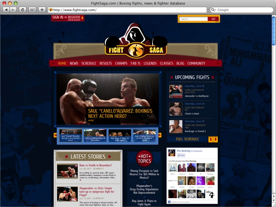
Above all, a website is considered successfull when the vision and expectations of the client and our own make amends with the needs of the user.
Analyzing FIGHTSAGA.COM, we saw step by step, which were some of the most important elements we had to think of to combine the aesthetics with the functionality, in order to achive the satisfaction of the client and finally the user itself.
Based on the old version of the site and a brief description of the client, we began our presentation by analyzing the procedure of design:
- Search for competitive or similar websites: how the market responds to such subjects.
- Inspiration: images, movies, books.
- Color palette, font and symbols: how these elements play an imporant role in the final result.
- Organizing the content: constructing the grid.
- Which were the challenges from the developer aspect.
- How the content should be organized, how many different K2 templates we had to use, with what parameters and why.
- What new we had to build to cover the complexity of this site. K2 plugins, K2 modules.
- How did we reach the final result.
Speakers: Chiara Aliotta, Yiota Ziaggou

