Leverage the power of rich media publishing the easy way!
Mark Paul
We are a team develop extensions for joomla.
K2 component is very powerful and we developing the best extensions for this.
We hope provide to everyone nice and amazing extensions.
03 June 2015
in
Extensions
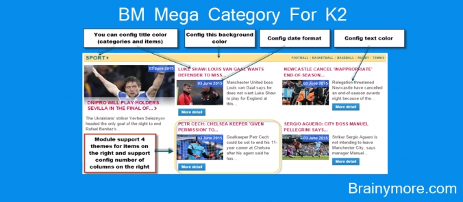
Use this module to show K2 items in various layouts.
Primarily built for homepage layouts, the module can fetch items using filters like latest, recent modified, recent published and more. Additionally:
Primarily built for homepage layouts, the module can fetch items using filters like latest, recent modified, recent published and more. Additionally:
- You can show sub catgories's items or not.
- You can config columns number for items display on the right of main item, it support from 1 to 6 columns.
- This module support responsive, it can display nice on every screen size (on mobile, tablet, laptop, desktop..).
- You can config font color, background for title, description. You also can config date format.
- Module has 4 themes for items on the right.
Tags:
22 September 2014
in
Extensions
- This module support for K2component.
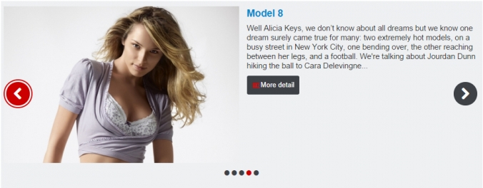
- This module show your items with images and descriptions on two parts (left or right).
- You can config to show image on left, right or top.
- This module support responsive, it display nice on every device and every screen size.
- You can get data from categories or from specific items.
- Module's theme: Image on left, Image on right, Image on top
- Resize type: SCALE FILL, SCALE INSIDE, SCALE OUTSIDE, CROP, CROP RESIZE, ORIGINAL IMAGE (select this option if you don't want image was resized).
- Timeout: seconds for change slide (if you put is 0, slider will not auto play.)
BM Mega Category For K2 More
10 June 2014
in
Extensions
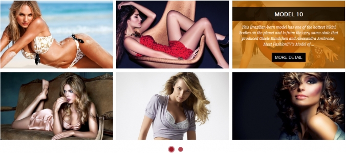
- This is a gallery to show items with many amazing effects when change page and many beautiful effects to show title & desciption when hover on images, module support for K2 component.
- Module support 10 effects when change page, images will fly very beautiful, you can't leave your eyes from images when they change.
- You can't believe that beside 10 effects for paging, it support 10 effects for hover event on images. It's true! You will surprise with effects for hover, they are smooth and beautiful.
- You can select data in categories or specific items that you want to show.
- You can config color for button of pagging.
- Module support responsive, you can config how you want it display on each screen size.
Module's configuration:
Data:
- Source from categories or items's id
- Count: Number items display
- Order items
- Get Images from: Intro image, Full articles image, intro text.
Display and Effects:
- Config image's width & height
- Select Resize Type: Scale fill, Scale inside, Scale Ouside, Crop, Crop resize.
- Number items per page: number of items you want show on one page
- Select effect: Support 10 amazing effects(Fall,Slide,Rotate Fall, Rotate Scale, Stack, 3D Flip, Bring Back, Supper Scale, Center Flip, Front Row)
- Select hover effect: Support 10 nice effects when hover images (Style1 to Style10). When hover it will show title, descripiton and button readmore.
- Title limit: Limit characters for title
- Readmore Limit: Limit characters for description
- Show description: Show description or not
- Kept Html: Kept html tag or not
- Show readmore: Show readmore button or not
- Readmore label: Change label for readmore button
- W1024 columns, W768 columns, W480 columns, W320 columns,W240 columns: Module support you config number of columns for each screen size.
- Buttons color: color for pagging buttons.
New Module:
BM Mega Category For K2
More
03 May 2014
in
Extensions
BM Tab For K2 is a special module to show items of K2 component. Because the module doesn't use any javascript, it only use CSS and CSS3.
Although has no javascript but the module still has nice effects! Please Enjoy it.
Although has no javascript but the module still has nice effects! Please Enjoy it.
- This is an easy and simple module to show your articles like a Tab.
- Module support to show items of content component.
- You can control number of tabs (items number).
- You can select color for tabs.
- Module support 4 effects for content (how show when change tabs).
- Show or hide title.
- Show or hide image.
- Add link to image or not.
- Show or hide description.
- Keep HTML of description or not.
BM Gird Slider For K2
BM Moon Slider For K2 (New)
More
09 April 2014
in
Extensions
This module shows images and content of K2 component (K2 slider or K2 slideshow). This a special module with amazing image and text effect. Module shows main images and thumbnails. When click to thumbnails main images and text will fly to their position. You can show or hide description, paging, arrows. You can make it auto play or not. You can change size for main and thumbnail images.
Supports joomla 2.5 and 3.x
Supports joomla 2.5 and 3.x
BM Slideshow Pro For K2 (New)
BM Moon Slider For K2
More
20 February 2014
in
Extensions
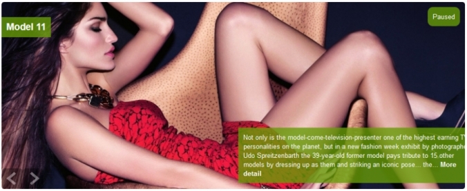
- Module BM Nice Slideshow Res For K2 is a powerful responsive slideshow.
- The module support 22 nice effects for change images.
- This is a dynamic slideshow with many params to config, you can control everything on your slideshow.
- Slideshow support responsive, so it display nice on all devices size( desktop, laptop, mobile, tablet..).
- You can config color text, icon font, title, loader..
- This module use icon font awesome, it use for icons, buttons(next, preview, pause, play, paging).
- You can control how description appear with 9 effects.
- You can see Userguide of module here.
Configs For Module:
CONFIG COMMON (Data)
- Category: Selects Articles from one or more Categories. If no selection will show all categories as default
- Show subcategory's items: Show subcategory's items of categories were selected
- Count: The number of Articles to display (the default is 5)
- Featured Articles: Show/Hide Articles designated as Featured4
- Order: Recently Added First: order the articles using their creation date. Recently Modified First: order the articles using their modification date. Recently Published First: order the articles using their publication date. Recently Touched First: order the articles using their modification or creation dates.
- Authors: Filter by author.
CONFIG DISPLAY & EFFECTS
- Image's width: Put image's width.
- Image's height: Put image's height.
- Thumb's width: Put thumb's width, use for thumbs on paging
- Thumb's height: Put thumb's width, use for thumbs on paging
- Select Resize Type: Select a Type to Resize Images (6 types, you can use ORIGINAL IMAGE type if want to show image not resized).
- Get Images From: Where do you to get a image from an article (Full article image, Intro Image or Intro Text).
- Auto Play: Auto play or not
- Auto play mobile: Auto play for mobile size
- progess bar position: Where you want progess bar display
- Progess bar direction: Select progess bar direction
- Effects: Select one or random effect for slideshow
- Columns effect: Number of columns will be processed
- Rows effect: Number of rows will be processed
- Easing effect: Easing for effect
- Description effect: Select how descripiton appear
- Stop Hover: Stop when hover
- Loader type: Select type for loader (bar, pie or none)
- Loader color: Choose color for loader
- Loader bg color: Loader background color
- Icon Font Color: Select color for icon font. color for next, preview, pause & play button, color for buttons of paging too
- Loader Opacity: Loader Opacity has value from 0 to 1, Eg: 0.1, 0.2 ... 1
- Loader padding: Change size of loader when use this param, bigger loader with bigger value
- Loader stroke: The thickness both of the pie loader and of the bar loader. Remember: for the pie, the loader thickness must be less than a half of the pie diameter
- Show Navigation: Yes or No, to display or not the navigation buttons
- Naviagtion Hover: Display Navigation when hover
- Mobile Naviagtion Hover: Display Mobile Navigation when hover
- Show Pagination: Yes or No, to display or not the pagination
- Play & Pause button: Yes or No, to display or not the play/pause buttons
- Pause on click: Pause slideshow when click
- Pie diameter: Width for loader has type is pie
- Pie Position: Select position for pie in slideshow
- SlideOn: next, prev, random: decide if the transition effect will be applied to the current (prev) or the next slide
- Show Thumbnails: Show Thumbnails when hover pagination
- Timer: milliseconds between the end of the sliding effect and the start of the nex one
- Transperiod: lenght of the sliding effect in milliseconds
CONFIG SHOW DATA
- Link color: Config color for link, you can also leave it blank it will display follow color of website
- Text color: Config color for tex, you can also leave it blank it will display follow color of website
- Show description box: Yes/No
- Title limit: Character number for title
- Readmore Limit: Character number for introtext, if you want show full introtext you can set is -1
- Show title: Turn on & off title
- Add link title: Add link title (Y/N)
- Select H tag for title: Tag for title
- Show info box: Info box contain: Author, Category, Publish, Hits
- Show author: Show author(Y/N).
- Show category: Show category (Y/N).
- Show publish: Show publish date (Y/N).
- Show hits: Show hits time (Y/N).
- Show description: Show description (Y/N).
- Show readmore: Show readmore button (Y/N).
- Kept Html: Kept html for description (Y/N)
- Show readmore: Show readmore button (Y/N)
- Readmore label: Change Readmore label here
- Description top: Margin top for Description. Value can be is 'px,%', eg: 100px or 40%, you can also leave it blank
- Description bottom: Margin bottom for Description. Value can be is 'px,%', eg: 100px or 40%, you can also leave it blank
- Description left: Margin left for Description. Value can be is 'px,%', eg: 100px or 40%, you can also leave it blank
- Description right: Margin right for Description. Value can be is 'px,%', eg: 100px or 40%, you can also leave it blank
- Description width: Width for Description. Value can be is 'px,%', eg: 100px or 40%
- Description height: Height for Description. Value can be is 'px,%', eg: 100px or 40%
- Load Jquery: Load Jquery If your website doesn't has Jquery file
Another our modules for K2:
BM Slideshow Pro For K2 (New)
BM Moon Slider For K2
BM Gird Slider For K2
BM Tab For K2
BM Sweet Slider For K2
BM Slider For K2
BM Flip Master For K2
BM Smooth Slideshow For K2
BM Accordion for K2
BM Top For K2
More
12 February 2014
in
Extensions
Module BM Slider For K2 support to show K2 items as a slider.
Support Responsive Feature, The slider (slideshow) can auto resize when display on other devices (Display nice on desktop, laptop, tablet, mobile).
This Module has 2 themes (Default and Theme1).
If you want a slideshow or a slider for your website, you are seeing it.
What are you waiting for, get it and love it.
The Module support:
* This is a Module for joomla 2.5 and 3.x
* Retrieve items from categories or Select specific items
* Image size : XSmall, Small, Medium, Large, XLarge
* Image's link: Link for image or not
* Select Themes: 2 themes, default and theme1
* Image's width & Image's width config
* Select Resize Type: Scale fill, Scale Inside, Scale Outside, Crop, Crop Resize
* Title limit: Limit text for title
* Readmore Limit: Limit text for description
* Show description or not
* Show readmore or not
* Readmore label: Label for readmore link
* Timeout: Time between each slide
* Visible items: number items, images show on first page - use for theme1
* Item start: Start item for slider
* Select effect: scrollHorz, fade, fadeout, carousel(use for theme1), none
* Hover: Stop when hover or not
* Responsive: you want slider auto resize please select 'Yes'
* Swipe: Yes or No
* Show paging: Yes or No.
* Load Jquery: Yes or No.
Another our modules for K2:
BM Slideshow Pro For K2 (New)
BM Gird Slider For K2
BM Sweet Slider For K2
BM Tab For K2
BM Moon Slider For K2
More
06 January 2014
in
Extensions
* This is a Module for joomla 2.5 and 3.x
* Work nice on all browsers.
* Show aticles's images:
* Module configs:
Another our modules for K2:
BM Nice Slideshow Res For K2
More
- The Module support to show K2 item's images ( K2 component ) or folder's images.
- You can control many part of slideshow, show them or not, it belong to you.
- You can select theme (5 theme), control part on it. It support many amazing animation (38 animations).
* Work nice on all browsers.
* Show aticles's images:
- Source: Select items from category or specific items.
- Category: Selects Articles from one or more Categories. If no selection will show all categories as default.
- Count: The number of Articles to display (the default is 5).
- Featured Articles: Show/Hide Articles designated as Featured.
- Order: Select article with order.
* Module configs:
- Select Themes: Give you 5 theme of Skitter.
- Image's width & Image's height: Set size for image to resize, it is slideshow's size too.
- Select Resize Type: You chose how articles's image is resized.
- Get Images From: Help you select image in an article to show (Full article image, intro image and intro text).
- Select Animation: Select animation you like (38 animations supported).
- Auto Play: Slidehow auto play or not.
- Show Controls: Show or hode control (Play & Stop button).
- Controls position: Where you want show control.
- Show Dots: Show pagiantion like dots (hover on dots will show thumb image).
- Easing: You can select one in many easing effects.
- Focus: Enable it and click to focus icon your slideshow will display on popup (it's nice!).
- Focus position: Where you want Focus icon display.
- Fullscreen: If you want slideshow display full screen.
- Hide all tools: It will all tools when display but will appear when mouseover tools.
- Interval: Speed change images.
- Show Lable: Show label or not.
- Label animation: Select animation for label (left, right, slideup, fixed).
- Show Navigation: Show next and preview button?
- Show number: Ahow pagination as number.
- Number align: Align for number.
- Show Preview: Show Preview buntton in navigation?
- Show Progessbar: Display Progessbar or not.
- Show random: Order display images is random or not.
- Stop when over: Slideshow will stop when mouseover or not.
- Show thumbs: Show thumb image or not.
- Velocity animation: Speed for animation.
- XML file: Path of XML file to load image and content. Eg: http://yourdomain/data/slides.xml. You can find demo for xml file in this module's assets/xml folder
Another our modules for K2:
BM Sweet Slider For K2 (New)
BM Nice Slideshow Res For K2
BM Slider For K2
BM Flip Master For K2
BM Smooth Slideshow For K2
BM Accordion for K2
BM Top For K2
More
06 January 2014
in
Extensions
Description:
- This is an amazing module for show categories's items like a tab. The module support for K2 component. It is a supper tab with many config help you control it. The module use ajax to load data, help your website look nice. This module maybe called is 'Tab Ajax Category', because each tab is one category was selected in module's config. When click to tab, the data will be loaded to tab content area. The module can show K2 categories like tabs or show 'Sepecific items'.
- The module support 5 themes (Default, Theme1, theme2, Theme3, Theme4). Sepcial Theme3 show items as a slidehow - Woa Amazing!
- Many configs to control element of tab (Show | Hide).
- Support Responsive: Could config columns for each screen width (devices: desktop, laptop, tablet, smartphone..)
- It can display like a listing page with loadmore button (load data ajax): Because you can select One category then config to hide tab header. Eg - If you want to build a content items listing page, you can select category is 'All category' then congfig to hide "tab header" with param "Show header tab".
- It can display like a slideshow too: If you select "Theme3" then hide "tab header", you will have a slideshow. Enjoy it!
Common Configs:
Select items from categories or from select specific items.
All category or Select Category.
Select categories these want to show.
Yes/No?.
Limit items number for each category (for paging).
Order for select items.
Show Featured items or not.
Select time.
Select items these you want to show.
Drag and drop to re-order items. Click the remove icon to remove an item from the list.
Get k2 items's image with size selected and resize on it.
When you select 'source' is 'Select Specific Items', you need config title for tab, has no category was selected, only items selected. If you don't select item, the module will get all items from all category.
Select tab's theme that you want. Support 5 theme (Default, Theme1, theme2, Theme3, Theme4).
Select 'Yes' First page of tabs will be loaded by Ajax. If you select 'No' First page of tabs will be loaded normal (no Ajax).
Select 'All' if you want all items will be appended one time else select 'Each' each item will be append to module's target.
Do you want to show no-image picture when item has no image?
You can hide 'tab header'. Module will become a listing or slider.
Set image's width for resize.
Set image's height for resize.
Support some type - SCALE FILL, SCALE INSIDE, SCALE OUTSIDE, CROP, CROP RESIZE.
Where do you to get a image from an article (Full article image, Intro Image, Intro Text).
Character number for introtext (short description).
Config for Default, Theme1, Theme2, Theme4 and some for theme3:
- Params config columns for each screen width:
Number columns for min width is 1024px.
Number columns for min width is 768px and max width is 1024px.
Number columns for min width is 480px and max width is 768px.
Number columns for min width is 320px and max width is 480px.
Number columns for min width is 240px and max width is 320px.
Turn on & off image.
Turn on & off title.
Add link for title (Y/N).
Add H tag for title if you want.
Show author(Y/N).
Show category (Y/N).
Show publish date (Y/N).
Show hits time (Y/N).
Show description (Y/N).
Show readmore button (Y/N).
Show icon readmore button (Y/N).
Show loadmore button (Y/N).
Config for Theme3:
Number of items will show on slideshow's one page.
This option determines whether or not a slideshow can advance from the last slide to the first (or vice versa).
for only this theme, Slideshow support Responsive or not
Support user can swipe on mobile, tablet, ..
Pause slideshow when hover.
Speed when change item.
Item's order to start slideshow, start from 0.
Time foreach change slide, If you put '0' value slideshow will not auto.
Select easing effect, This config support for all theme.
Load Jquery If your website doesn't has Jquery file. If Your website has loaded JQuery You should select 'No' For sure this module can run correct!
Another our modules for K2:
More
- This is an amazing module for show categories's items like a tab. The module support for K2 component. It is a supper tab with many config help you control it. The module use ajax to load data, help your website look nice. This module maybe called is 'Tab Ajax Category', because each tab is one category was selected in module's config. When click to tab, the data will be loaded to tab content area. The module can show K2 categories like tabs or show 'Sepecific items'.
- The module support 5 themes (Default, Theme1, theme2, Theme3, Theme4). Sepcial Theme3 show items as a slidehow - Woa Amazing!
- Many configs to control element of tab (Show | Hide).
- Support Responsive: Could config columns for each screen width (devices: desktop, laptop, tablet, smartphone..)
- It can display like a listing page with loadmore button (load data ajax): Because you can select One category then config to hide tab header. Eg - If you want to build a content items listing page, you can select category is 'All category' then congfig to hide "tab header" with param "Show header tab".
- It can display like a slideshow too: If you select "Theme3" then hide "tab header", you will have a slideshow. Enjoy it!
Common Configs:
Select items from categories or from select specific items.
All category or Select Category.
Select categories these want to show.
Yes/No?.
Limit items number for each category (for paging).
Order for select items.
Show Featured items or not.
Select time.
Select items these you want to show.
Drag and drop to re-order items. Click the remove icon to remove an item from the list.
Get k2 items's image with size selected and resize on it.
When you select 'source' is 'Select Specific Items', you need config title for tab, has no category was selected, only items selected. If you don't select item, the module will get all items from all category.
Select tab's theme that you want. Support 5 theme (Default, Theme1, theme2, Theme3, Theme4).
Select 'Yes' First page of tabs will be loaded by Ajax. If you select 'No' First page of tabs will be loaded normal (no Ajax).
Select 'All' if you want all items will be appended one time else select 'Each' each item will be append to module's target.
Do you want to show no-image picture when item has no image?
You can hide 'tab header'. Module will become a listing or slider.
Set image's width for resize.
Set image's height for resize.
Support some type - SCALE FILL, SCALE INSIDE, SCALE OUTSIDE, CROP, CROP RESIZE.
Where do you to get a image from an article (Full article image, Intro Image, Intro Text).
Character number for introtext (short description).
Config for Default, Theme1, Theme2, Theme4 and some for theme3:
- Params config columns for each screen width:
Number columns for min width is 1024px.
Number columns for min width is 768px and max width is 1024px.
Number columns for min width is 480px and max width is 768px.
Number columns for min width is 320px and max width is 480px.
Number columns for min width is 240px and max width is 320px.
Turn on & off image.
Turn on & off title.
Add link for title (Y/N).
Add H tag for title if you want.
Show author(Y/N).
Show category (Y/N).
Show publish date (Y/N).
Show hits time (Y/N).
Show description (Y/N).
Show readmore button (Y/N).
Show icon readmore button (Y/N).
Show loadmore button (Y/N).
Config for Theme3:
Number of items will show on slideshow's one page.
This option determines whether or not a slideshow can advance from the last slide to the first (or vice versa).
for only this theme, Slideshow support Responsive or not
Support user can swipe on mobile, tablet, ..
Pause slideshow when hover.
Speed when change item.
Item's order to start slideshow, start from 0.
Time foreach change slide, If you put '0' value slideshow will not auto.
Select easing effect, This config support for all theme.
Load Jquery If your website doesn't has Jquery file. If Your website has loaded JQuery You should select 'No' For sure this module can run correct!
Another our modules for K2:
BM Tab For K2 (New)
BM Sweet Slider For K2
BM Slider For K2
BM Flip Master For K2
BM Smooth Slideshow For K2
BM Accordion for K2
BM Top For K2
More
09 November 2013
in
Extensions
* This is a Module for joomla 2.5 and 3.x
* Work nice on all browsers.
* Show aticles's images:
BM Nice Slideshow Res For K2
More
- The Module support to show K2 item's images ( K2 component ) or folder's images.
- You can control many part of slideshow, show them or not, it belong to you.
- You can select theme (5 theme), control part on it. It support many amazing animation (38 animations).
* Work nice on all browsers.
* Show aticles's images:
- Source: Select items from category or specific items.
- Category: Selects Articles from one or more Categories. If no selection will show all categories as default.
- Count: The number of Articles to display (the default is 5).
- Featured Articles: Show/Hide Articles designated as Featured.
- Order: Select article with order.
- Select Themes: Give you 5 theme of Skitter.
- Image's width & Image's height: Set size for image to resize, it is slideshow's size too.
- Select Resize Type: You chose how articles's image is resized.
- Get Images From: Help you select image in an article to show (Full article image, intro image and intro text).
- Select Animation: Select animation you like (38 animations supported).
- Auto Play: Slidehow auto play or not.
- Show Controls: Show or hode control (Play & Stop button).
- Controls position: Where you want show control.
- Show Dots: Show pagiantion like dots (hover on dots will show thumb image).
- Easing: You can select one in many easing effects.
- Focus: Enable it and click to focus icon your slideshow will display on popup (it's nice!).
- Focus position: Where you want Focus icon display.
- Fullscreen: If you want slideshow display full screen.
- Hide all tools: It will all tools when display but will appear when mouseover tools.
- Interval: Speed change images.
- Show Lable: Show label or not.
- Label animation: Select animation for label (left, right, slideup, fixed).
- Show Navigation: Show next and preview button?
- Show number: Ahow pagination as number.
- Number align: Align for number.
- Show Preview: Show Preview buntton in navigation?
- Show Progessbar: Display Progessbar or not.
- Show random: Order display images is random or not.
- Stop when over: Slideshow will stop when mouseover or not.
- Show thumbs: Show thumb image or not.
- Velocity animation: Speed for animation.
- XML file: Path of XML file to load image and content. Eg: http://yourdomain/data/slides.xml - You can find demo for xml file in this module's assets/xml folder
